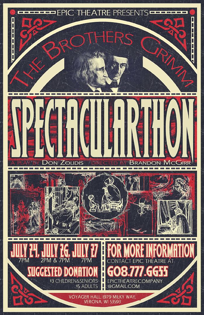
AHAHAHA that looks super cool. The only thing I'd have to say is that where it says "A Play By" and "Directed By" in red under the title with the names, it might be harder to read. I'm just saying that by looking at it on my monitor; I have no idea how it'll look in person.
I really dig the vibe in general and the palette too. It's like "sinister Victorian", which is perfect of course. Did you layer an invert all those little portraits in the lower-middle? It's so unique/odd and it really ties the whole thing together.
My only criticisms would be what an above comment said about the 'A Play By' and 'Directed By' titles are a bit difficult to read. Just a thought, but maybe you could try to put a very thin border of white around them to bring them out. Also, the dashed lines seem a little awkward; a little too mechanical and non-old-fashioned. My thought was to put tiny little joiners (like little biconcave candlestick shapes) in between each dash (and more) to make them more ornamental. Which I think I will look really good with the vibe you have going. Anyway, these are very minor things, but I thought they might be interesting to hear.
But overall, great job, man. If this is a for-pay thing, I hope your getting paid handsomely because they're getting professional-grade work.
no subject
Date: 2008-06-28 07:51 pm (UTC)no subject
Date: 2008-06-28 08:00 pm (UTC)(... although it is all scratched up)
no subject
Date: 2008-06-28 08:01 pm (UTC)no subject
Date: 2008-06-28 08:29 pm (UTC)no subject
Date: 2008-06-28 09:04 pm (UTC)no subject
Date: 2008-06-29 02:23 am (UTC)no subject
Date: 2008-06-29 04:12 am (UTC)My only criticisms would be what an above comment said about the 'A Play By' and 'Directed By' titles are a bit difficult to read. Just a thought, but maybe you could try to put a very thin border of white around them to bring them out. Also, the dashed lines seem a little awkward; a little too mechanical and non-old-fashioned. My thought was to put tiny little joiners (like little biconcave candlestick shapes) in between each dash (and more) to make them more ornamental. Which I think I will look really good with the vibe you have going. Anyway, these are very minor things, but I thought they might be interesting to hear.
But overall, great job, man. If this is a for-pay thing, I hope your getting paid handsomely because they're getting professional-grade work.
no subject
Date: 2008-06-29 02:42 pm (UTC)no subject
Date: 2008-06-29 05:42 pm (UTC)no subject
Date: 2008-06-29 09:55 pm (UTC)