jackshoegazer: (777 Pyramid Eye Sun)
[personal profile] jackshoegazer
I have been sleeping the oddest hours lately. So as long as I'm going to be getting up between 2:30 and 4:00 am this weekend, I may as well get something done.

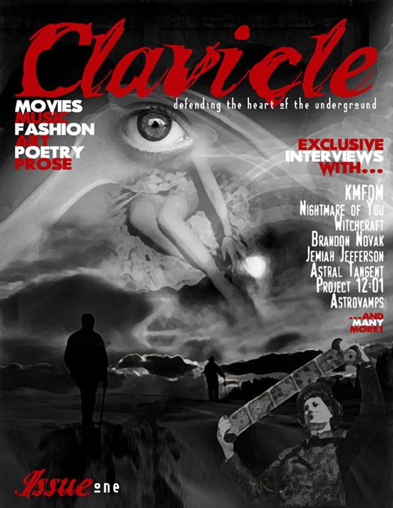
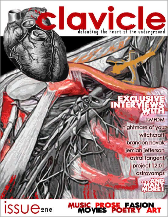
Last night and this morning, I designed two covers for Clavicle, the magazine that is publishing my story and poem. They told me they very well might need some graphic design work for the zine, so I made these two covers to sort of showcase my design work. And they said the might use them! For the COVER!

The Senior Editor said the team would vote on which one they like, so without further ado, I present COVER-ONE and COVER-TWO. And I ask that you, dear reader, also vote for your favorite.

Date: 2005-09-25 12:47 pm (UTC)

Date: 2005-09-25 01:52 pm (UTC)
From: [identity profile] mananath.livejournal.com
I like the first one. It is more subdued and subtle. I don't like, on the second one, how the tagline is "defending the heart..." and then there is a giant heart right next to it. It leads nothing to the imagination. And, besides, thats a pretty big heart -- it will offend all those readers with small or damaged hearts. ;)

Date: 2005-09-27 09:53 pm (UTC)
From: [identity profile] jackshoegazer.livejournal.com
HEY! *I* have a damaged heart! Sortof. I'm offended by your mention of anything heart related! You'll be hearing from my attourney!

Date: 2005-09-25 02:23 pm (UTC)
From: [identity profile] choogy.livejournal.com
the first one is more noir than bloody (as opposed to #2) but there is a minor typo in the second one [sic: fasion] but that first one really pops with red graphics. i hope they take it!

Date: 2005-09-27 10:07 pm (UTC)
From: [identity profile] jackshoegazer.livejournal.com
Egads,the embarassment! I willfully surrender myself to the horrors of the Grammar Nazis, who will bake me down into white-out and correction fluid!

They're voting between my two covers, so I'm pretty sure I'll get the cover, it just depends on which one :)

my two cents...

Date: 2005-09-25 04:09 pm (UTC)
From: [identity profile] enodia.livejournal.com
The first one has more diverse and intriguing imagery, and also a more polished look, to my mind anyhow. I did enjoy the painterly and visceral feeling of the second one as well though.

Date: 2005-09-25 04:53 pm (UTC)
From: [identity profile] sarahdipity418.livejournal.com
Another vote for number one. I'd like to know which is YOUR favorite!

Date: 2005-09-27 10:09 pm (UTC)
From: [identity profile] jackshoegazer.livejournal.com
I like the first one most, but the second one is technically a better design. I wish I could blend the two, best of both worlds and all that :P

my 31/2 cents' worth..

Date: 2005-09-25 05:16 pm (UTC)
From: [identity profile] particleorwave.livejournal.com
dang it - they're both good! The first has a surreal quality to it that catches the eye(as one is caught by the eye); but the second one...well, I am a color freak - if I were even remotely graphically talented, I'd use that one, but colorized more - with the colors draining from the edges of the heart, as if ripping it from the chest, it loses the life it's being torn from as the color sprays down into the oven cavity - the colors catching the eye, with less red and some contrasting splashes of cobalt blue, mustard yellow, and even lime green...not sure what their print budget is, but you get my point...color would draw the eye to the cover, the absurdity of the colors used would keep them looking for a moment more, maybe, before hopefully deciding to buy it...

Re: my 31/2 cents' worth..

Date: 2005-09-25 05:17 pm (UTC)
From: [identity profile] particleorwave.livejournal.com
open cavity...oops..

Date: 2005-09-25 07:00 pm (UTC)
From: [identity profile] gamine3.livejournal.com
I am right there with you on the sleep thing...strange blasted dark half of the year. It's where all the good stuff is anyhow, though.

Date: 2005-09-25 07:02 pm (UTC)
From: [identity profile] gamine3.livejournal.com
Oh, and number one, without a doubt.

Date: 2005-09-26 12:56 am (UTC)
From: [identity profile] nonexsistent.livejournal.com
I would also have to go with number 1.

Date: 2005-09-27 04:19 pm (UTC)
From: [identity profile] jackshoegazer.livejournal.com
Thanks for your input. The senior editor is leaning toward 1 as well, buti sputting it up for a vote.

hearts

Date: 2005-09-26 02:48 am (UTC)
From: [identity profile] anarch-king.livejournal.com
real ones anyway
hard to work into a composition

I like the ONE one better, just technically.
The TWO one makes me think "ripping the heart out of the underground"
Maybe thats just me.

Re: hearts

Date: 2005-09-27 04:15 pm (UTC)
From: [identity profile] jackshoegazer.livejournal.com
If you were in a store, with the intention of, oh, buying a magazine, which cover would appeal to your sense of consumerism?

Date: 2005-09-26 06:47 pm (UTC)
From: [identity profile] antarcticlust.livejournal.com
Ya'll are crazy. Number two (sans typo) is the superior one by far- at least for a magazine cover. Though Number One is more Goth, I suppose. But still, my opinion should count for a hundred other opinions, right? Right?!


Damn it, I'm just not that kind of girl. I can't even pull it off.


I still like number two, though.

Date: 2005-09-27 04:08 pm (UTC)
From: [identity profile] jackshoegazer.livejournal.com
I think the second one is technically a better design, but the first is more appeasing to the eye.

Date: 2005-09-27 05:16 pm (UTC)
From: [identity profile] antarcticlust.livejournal.com
Maybe to SOME eyes. Perhaps mine are deficient. I think they're on the smallish side and an unconventional color. Of course, I'm an unconventional girl.

Profile

jackshoegazer: (Default)
jackshoegazer

February 2012

S M T W T F S
   12 34
567891011
12131415161718
19202122232425
26272829   

Most Popular Tags

Style Credit

Expand Cut Tags

No cut tags
Page generated Jun. 23rd, 2025 01:37 am
Powered by Dreamwidth Studios